


- by David Clark
Vexillologists agree that Owen Sound’s flag is “bad”. Okay, no vexillogist singled out Owen Sound by name but they have declared most cities have very bad flags and Owen Sound’s fails on all Five Principles of Flag Design.
First here are a few (opinionated) concerns about Owen Sound’s current flag.
1. It is not gender neutral. The two figures on the flag are male.
2. The colonizer and the Indigenous person are standing, as it seems, as equals, but history records Indigenous people were treated as less than equal: We live on stolen lands. The colonizer’s axe represents clearing the land -cutting down trees (crwflags.com).
3. The wheat sheaves, anchor, and gear wheel are not relevant to current economic conditions, and should be replaced by a cash register representing a primarily service economy. History is not what it used to be.
4. The flag can be only viewed from one side because of the lettering; it has a front and a back (note that today's north wind makes the words backwards from street view).
5. According to one website (crwflags.com/fotw/flags/ca-on-od.html) the “horn is based on local story that suggests (emphasis added) our first citizen, John Telfer, blew the horn to attract the attention of the government surveyor...to indicate this was a desirable location for a new community”: this sounds like pure mythology, if oft-repeated.
Now, let’s look at the principles as posted by the Flag Institute (flaginstitute.org) and application to Owen Sound’s flag.
Principle 1: Keep It Simple. The flag should be so simple that a child can draw it from memory. (Comment: An adult would have trouble reproducing the city’s flag; too complex.)
Principle 2: Use Meaningful Symbolism. The flag's images, colours, or patterns should relate to what it symbolizes. (Comment: Okay, there is some adherence to this principle, but see Principle 1... it is not simple!)
Principle 3: Use 2 or 3 Basic Colours. Limit the number of colours on the flag to three which contrast well and come from the standard colour set. (Comment: There are five colours in the design: red, white (technically not a colour), green, gold/yellow, and black/grey.)
Principle 4: No Lettering or Seals. Never use writing of any kind on an organization's seal. (Comment: The flag is not easily identifiable enough with Owen Sound so include the city’s name, province, and county. Only missing “North America” and “Earth” for more precision. Also, the Latin words (arbor virga fuit) cannot be read easily unless the viewer is within a few metres of it. Just what is the significance to Owen Sounders of the English translation, "as the twig is bent so grows the tree"? And what does it mean to Owen Sounders?
Principle 5: Be Distinctive or Be Related. Avoid duplicating other flags, but use similarities to show connections. (Comment: It is not distinctive as so many other city flags follow a similar design.)
Here are examples deemed as “good” flags, by Vexillologists.
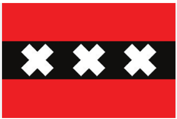
Now, who wouldn’t want to wear this on a t-shirt? The city of Amsterdam’s flag is a “good” flag -once you’ve seen it you won’t forget it. The crosses and black bar are taken from its coat of arms.
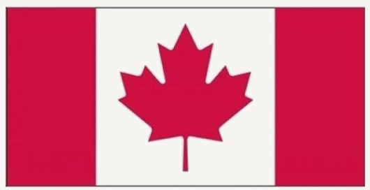
Canada’s flag is also considered a good flag, one that the whole world recognises and even non-Canadian travellers like to wear.
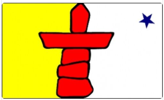
The last example is Nunavut. It is a great design and very recognisable.
The city of Owen Soud needs a new flag ... a “good flag”.
I have sketched out a few ideas, not that these are good designs, but they suggest possibilities and adhere to vexillology’s principles. After sketching out a few designs based on characteristics and features of Owen Sound, I applied the approach used for Amsterdam’s flag…using elements of its current flag. Importantly I made new interpretations of some elements.

First, I retained the dynamic red background. It is very visible from a distance. It also aligns with both Ontario’s and Canada’s flags, positioning Owen Sound as part of these geographies.
Second, originally white, now represents the bay, two rivers, and the (relatively) unpolluted air/sky for which people visit this area. I experimented with up and down versions but “up” just feels better.
Third, the tree represents the ruralness and the natural beauty of the area. The tree is not to be cut down as represented in the current flag. It happens to align with Owen Sound’s “Tree City of the World” but is not included for that reason.
Fourth, the white horizontal line is really just an element to create a break from the large area of red. One version has a thinner line set lower and one with a wider line at the half-way point. The line could represent the physical division of the city by the Sydenham River. Design number 5 illustrates a different version of the crest and how it could look with a white line or none (cover one side, then the other, to see two versions).
These designs meet all flag design rules except for colours; it uses basic colours but is a few more than two to three as recommended. The flag can be viewed from either side with no front and back. It is simple in design but not simple in what its elements represent. I think importantly, it recycles familiar elements from the current flag but reinterprets them.
In summary, Owen Sound needs a new flag, one that does not attempt to present a complex history using select (potentially divisive) elements, that I believe, represents a colonizer history. Presentation of history is not the role of city flags. Cities are too complex to attempt a “Cole’s Notes” version of its history on a flag.


